

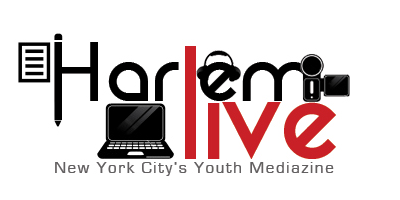
You may look at the logo above and say to yourself ",I like it." You may like it because it touches base with all the aspects of harlemlive. Video, audio, writing, and a computer are in this logo. Logos must be simple and this logo is way too busy. With logos less is always more. Logos should also be versatile. Lets look at the logo under real world conditions.
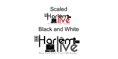
Scaled or in black and white the logo becomes hard to read. "Harlem" begins to look like "HarlenL". People that will see this for the first time will be given the wrong impression of harlemlive. The graphics which are supporting the logo take attention from the message of the logo. lets look at other companies logos next to ours.

We look at the logos and ours side by side and ours looks like the odd one out. It breaks logo rules while these companies follow them. Simple, readable, versatile, and scalable. Lets move on to the next logo.

This logo doesn't have anything to do with harlemlive. The first logo had too many Cameras and doodads, now just harlem which looks like "horlem" and the "live" is next to impossible to read when scaled down.
The colors are not a color scheme I'd paint on the walls of my worst enemy. It's the colors of unwanted Ju Ju Beans; lemon, green, and licorice. People are funny(aka not smart). Some people may read "Horlem luie" or "Horlem liue" which is what it looks like.
Solutions to these problems:
think of one thing that harlem live is known for and focus on it.

I pick something that has to do with video production. When you see this type of light things come to mind. TV shows, Movies, Sets of late night tv, and production. This is why I picked a stage light. Another thing is readability. When a logo is busy or complex people won't read or bother with it. A well known marketing fact is people are lazy and don't want to spend to much time on anything, especially a still picture. I went for Simple, readable, versatile, and scalable.

This is not to say this is what the logo should look like. This is just an example of a logo that follows the rules. lets look at our logo with other companies.

It looks like it belongs with these giants. If your saying "I don't like purple" then your missing the point. The goal of a logo is to have a simple readable symbol that brands the minds of people. If you want to look more into what makes a great logo look here. If you are still in love with the 2 logos, design is not for you. Design doesn't just happen its designed.


